

What is a quasi-experimental design (QED)?
Quasi-huh?... Often we want to know whether a program works or not. These are what we call questions of causality, meaning does the program cause changes in the things we care about. A key to answering questions about “whether a program works” is being able to compare what happens with the program to what happens without the program. We’re always trying to compare two groups that are as similar as possible—except for the presence or absence of the program.
Ideally, we would conduct a randomized evaluation, since randomly assigning who gets a program is the surest way to end up with two groups that are alike in every respect—the things we can measure and the things we can’t. But that isn’t always possible or sensical. Sometimes a program has already launched, sometimes it has to be offered to everyone who qualifies, and sometimes the decision about who or what got the treatment was made long before anyone thought to evaluate it.
So we look for the next best thing: a naturally-occurring situation in which two nearly identical groups end up on opposite sides of a program or treatment. Those situations often arise because of how the program is administered—such as an eligibility cutoff, a phased rollout, or a pilot impacting only a few schools. Studies that take advantage of these scenarios are called quasi-experimental evaluations, or QEDs. The studies can use different analytic methods but share the goal of constructing a comparison group that shows us, as credibly as possible, what would have happened without the program. The four designs described on this page use different approaches to finding a fair comparison. Choosing one depends on how the program was implemented.
Here’s an example:
Imagine an agency partners with a community-based organization to run an after-school tutoring program for middle schoolers—let’s call it Homework Club. Students get small-group tutoring twice a week, and the agency wants to know whether it improves attendance and reading scores.
The tempting first move is to compare students who attended Homework Club to students who didn’t. That will almost certainly mislead us. If families opted in, the students who enrolled may be the ones with a caregiver who can manage a later pickup, or a teacher who took an interest, or had their own spark of motivation—all things that help attendance and reading with or without tutoring, making the program look effective even if it did nothing. Flip the story and it’s bad too: if teachers only referred the students they were most worried about and the enrolled group was struggling more to begin with, we might not see an effect— it could even look like the program hurt students!
The two groups differ not just in whether they got tutoring, but in how they came to get it. So the practical question isn’t which QED method is fanciest—it’s how students ended up in the program.
| If the program was rolled out like this… | …we can build a comparison group like this | …using this design |
|---|---|---|
| Open to everyone; students and families chose whether to sign up | Find non-participants who were the same as participants before the program started with respect to grade, attendance, test scores, and other factors | Propensity score matching |
| Eligibility was set by a score, an age, an income threshold, a date, or a geographic boundary | Compare people just barely eligible to people just barely not | Regression discontinuity |
| Launched at some schools but not others | Track both sets of schools before and after, and ask whether the gap between them widened or narrowed | Difference-in-differences |
| Launched in exactly one place, with no obvious twin | Build a stand-in for the treated place out of a weighted blend of the other, untreated places | Synthetic control |
What is Propensity Score Matching?
Suppose Homework Club is open to any student who wants it, and about 20% sign up. We can’t fairly compare enrollees to everyone else, but we can compare each enrollee to the non-enrollees who most resemble them: same grade, same school, similar attendance and reading scores the prior year. That is, their baseline characteristics.
Matching on a long list of baseline characteristics one-by-one quickly becomes impossible since no two students are exactly alike. Propensity score matching collapses that list into a single number. We use the pre-program data to model each student’s chance of enrolling based on their baseline characteristics. That predicted probability is the propensity score: a student at 0.7, based on everything we observed at baseline, had a 70% probability of enrolling; a student at .1 only had a 10% probability. We then compare enrollees to non-enrollees with nearly the same score, either by pairing them directly or by weighting the comparison group to resemble the enrollees’.
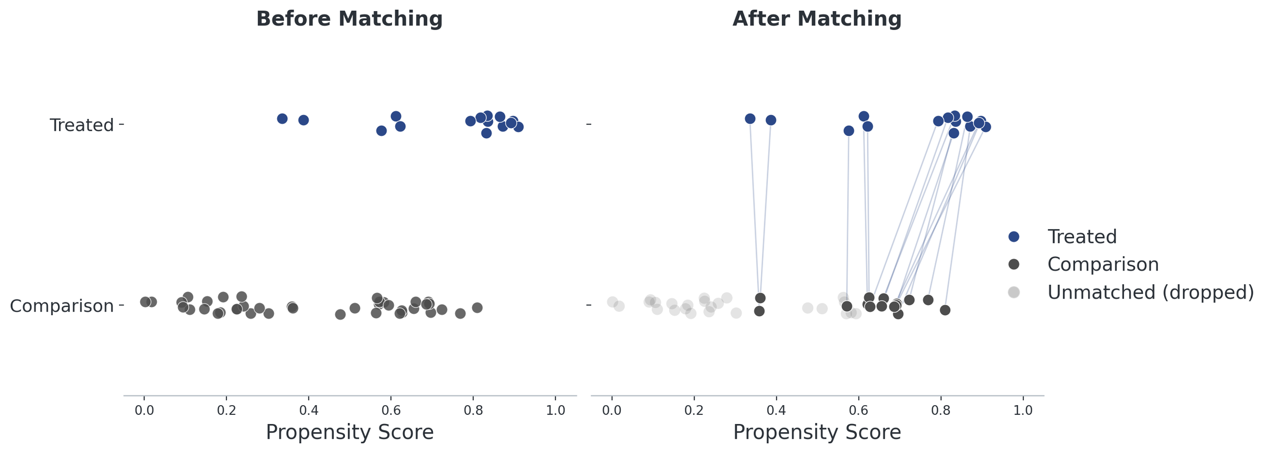
Figure 1. Matching doesn’t create new students—it selects the ones we have so the comparison group looks like the program group on every characteristic we measured.
For this approach to work, we need the two groups— the Homework Club students and the comparison group—to look as similar as possible. So, we check balance: after matching, are the two groups actually similar on each baseline characteristic, or do we need to make tweaks to the matching process? We also notice who dropped out—students with no comparable match leave the analysis, so the result can only describe the students we could match.
The big limitation is that matching can only balance the characteristics we have data about. We can’t measure everything and sometimes, those characteristics are really important for why someone enrolled. For example a caretakers’ schedule flexibility, or whether a student’s friends were for or against Homework Club. We may miss an important part of the story because we can’t see those differences in the data. This limitation is why matching is generally the least conclusive QED design, though it’s still far more informative than just directly comparing students who attended to those who didn’t.
What is a Regression Discontinuity Design (RDD)?
Now suppose there are more interested students than seats, so the agency sets a rule: middle school students scoring below 60 on a reading test are offered Homework Club tutoring, and students above are not.
That rule creates an opportunity for evaluators. A student with a score of 59 and a student with a 61 are probably similar. If nothing meaningful separates them except that one was offered tutoring, the rule did something close to what a randomization would do. This means that near the cutoff, we can compare outcomes just below the line to outcomes just above it. Any abrupt change in outcomes at the eligibility cutoff may be due to the program.
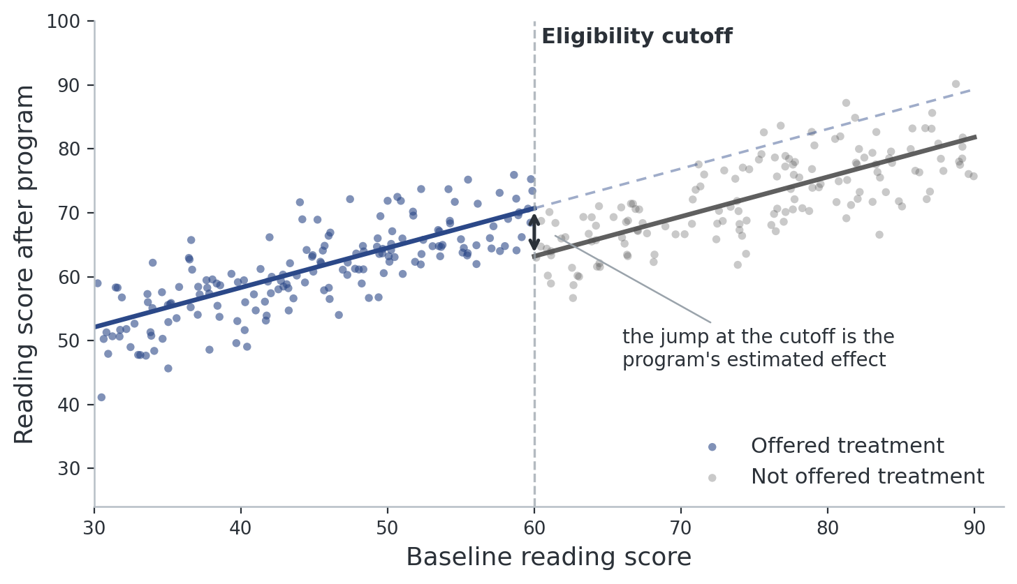
Figure 2. Reading scores after the program rise steadily in relation to baseline scores. The break at the eligibility cutoff is what the tutoring did—students just below the eligibility cutoff ended up above the average for students just above the cutoff.
This approach rests on one important assumption called ‘parallel trends’. That states that absent the program, attendance at the treated schools would have moved the same as attendance at the comparison schools. We can’t verify that for the years after the program, but it’s critical to check the years pre-program by plotting attendance rates for both groups of schools and checking that the two lines rise and fall together. If they were already diverging, you can’t use DiD.
Another big problem for this design is if something else changed at the treated schools at the same moment—a new principal, a new grant that arrived at the same time as the program we’re interested in. Then Homework Club can’t be separated from whatever else appears at the same time, which is why knowing the program and talking with the people running it matters a great deal for our ability to accurately analyze the data.
What is a Difference-in-Differences Design (DiD)?
Imagine that the District chose to launch Homework Club at twelve middle schools in 2023, with the rest of the District scheduled for later years. Some schools are treated and others aren’t, and we have several years of attendance data for all of them.
Comparing treated schools to untreated schools after the program won’t work if the treated schools were chosen for a reason. In that case, the treated schools may have already been different. Comparing Homework Club schools before and after the program won’t work either, since attendance across the District has been changing for reasons unrelated to the program.
DiD uses both comparisons to cancel out both problems. First difference: how much did attendance change at the tutoring schools from before to after? Second difference: how much did it change at the comparison schools over the same period? Subtract the second from the first. The first subtraction removes anything constant and different about the Homework Club schools (e.g., an older building, a higher-poverty enrollees). The second removes anything that impacted all District schools at the same time (e.g., a lot of snow that year or a district-wide effort to boost attendance). What’s left is the change that happened only at the schools with the new program after the program started. You can think about this approach as looking at the gap between the treated and control schools, and seeing if it widened or narrowed while the program was offered.
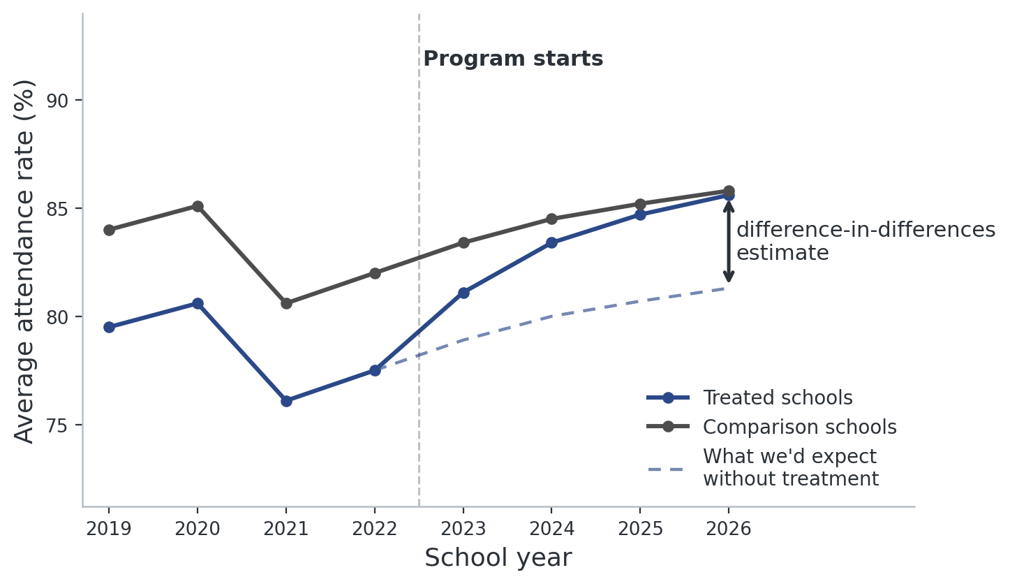
Figure 3. Subtracting the comparison schools’ change from the treated schools’ change estimates the effect of the treatment.
This approach rests on one important assumption called ‘parallel trends’. That states that absent the program, attendance at the treated schools would have moved the same as attendance at the comparison schools. We can’t verify that for the years after the program, but it’s critical to check the years pre-program by plotting attendance rates for both groups of schools and checking that the two lines rise and fall together. If they were already diverging, you can’t use DiD.
Another big problem for this design is if something else changed at the treated schools at the same moment—a new principal, a new grant that arrived at the same time as the program we’re interested in. Then Homework Club can’t be separated from whatever else appears at the same time, which is why knowing the program and talking with the people running it matters a great deal for our ability to accurately analyze the data.
What is a Synthetic Control (SC)?
Imagine that funding is limited so Homework Club is piloted at only one school. There’s no group of treated schools to average over, and no other school is quite right as a perfect comparison to the pilot—one is bigger, one is in a different ward, one handed out free apples every morning.
That’s where a design called a synthetic control comes in. If no single school is a good stand-in comparison, we use a lot of real data from multiple schools to build the perfect comparison. This method searches over all the other schools and assigns each a weight, choosing the combination whose attendance history most closely tracks the pilot school’s history before the program began. That might lead to some combination like 40% School A, 35% School B, and 25% School C gives a very similar history relative to our one treated school. This weighted combination doesn’t exist, but it was assembled from real data to behave exactly like the pilot school did pre-program. This method also requires a lot of data from the years prior to the program. Once Homework Club tutoring starts, the synthetic comparison school imagines what would have happened at that pilot school had the program never happened.
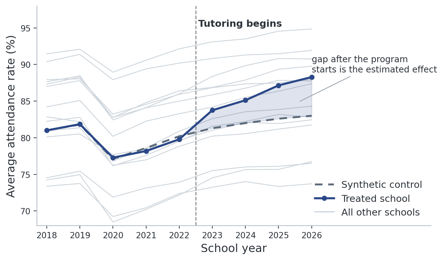
Figure 4. No single school matched the treated pilot school perfectly, but a weighted combination of several other schools did, which makes up the synthetic control comparison. After the program begins, the outcomes start to look different between the two, which is the estimated effect of the program.
Because there’s only one treated unit, conventional statistics can’t tell us whether the gap is meaningful. Instead, we run tests on the computer pretending, one at a time, that each comparison school received the program. If the pilot school’s actual change stands out from all those tests, we have evidence that the program was impactful.
How rigorous are QEDs?
It depends—and what it depends on is not about how sophisticated the statistics are. It’s how believable the comparison group is.
A randomized evaluation is the most rigorous method of assessment because randomizing makes the two groups alike in every way. What we measured, what we forgot to measure, and what we couldn’t have measured if we tried. No QED can do that. Each QED method rests on assumptions such as whether the comparison was on a parallel path before the program started. These assumptions require a lot of knowledge of the time, place, and implementation, which The Lab is well suited to discover.
If assumptions are met, some QED designs are usually stronger than others. Designs that lean on a rule someone else made—an eligibility cutoff set by policymakers, or a site chosen for budget reasons—tend to give more trustworthy answers than designs that lean on statistically matching people who chose to enroll versus not. These specifics are important and will always be clearly stated in Lab results.
How does The Lab use QEDs?
Now that you’ve read about QEDs, check out a few examples of how we’ve used the technique to answer these questions for Washingtonians: